Art Style Brain Dump
Wrestling with which direction to take the art style of the game.
My original thoughts were pixel art, but what fidelity? In my heart I love high fidelity styles, but the practicalities of the amount of art work and the time it will take I think is subconsciously playing on my mind.
I've been prototyping with limited desaturated palettes. Which feels much more because I think it will look 'cool' - ironic pun intended, (or probably not. ) Something like Eastward. I don't want to look like Stardew Valley - the bright pop doesn't fit with the concept of Human struggle. But something like Sword & Sworcery - do I admire it rather than love it? as something I could do a whole game in?
Should I do something interesting around our general plight as idiot humans taking the world from a bright simply time to a darker more washed out existence.
I quite like that as a concept. Maybe taking the palette through steps of saturation during different eras. The Dark Ages are dull, renaissance is bright.
I think that is the answer. I was going to try a monochrome palette but it isn't me. Or maybe the backgrounds could be monochrome, to dictate the mood of the era (cool blue, hot yellow )
Plenty still to think about and concepts to play with.
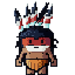
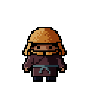
Initial draft characters Aztec & Samurai - for ears I'm no longer going to use :facepalm: 

Odyssey of Kairo
Mankind's challenges and achievements through the ages.
| Status | In development |
| Author | WOODEDGE |
More posts
- Sketch Game OutlineMay 28, 2024
Leave a comment
Log in with itch.io to leave a comment.